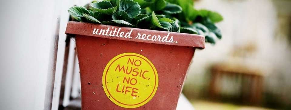
Songbird


May
31
Lovely Mix & Criticism
Filed Under Music Mix Up

Ok so I need some constructive criticism on the new site it is not completely transferred over but there is enough up for you to get a general idea of what it is going to look like…Specifically I need a few questions answered…
1. What do you think about the black text on white background opposed to the white text on a black background?
2. Which side should the sidebar be on? The left or right?
And if you have anything else you would like to add by all means speak up or forever hold you peace. ;-)
The following mix of songs is just some recent releases I have been enjoying the past few days and I thought you all would enjoy them as well. So that is all I got for you, I am looking forward to hearing what you all think of the new look. And Mentok now you know I haven’t been just fucking around this entire time, I really have been working on it. :-p
mp3: More Past – Trespassers William
Noble House EP 2007 – Get It
(Some of you may remember Trespassers William from a long time ago here)
mp3: In A Wreck – Morningbell
Through The Belly Of the Sea 2007 – Get It
mp3: The Canadian Shield – A Northern Chorus
The Millions Too Many 2007 – Get It
(Thanks to Colin for introducing me to this amazing band)
mp3: Breathe – The Cinematic Orchestra
Ma Fleur 2007 – Get It
(I have been listening to this album non-stop, I highly recommend checking it out)
Comments
11 Responses to “Lovely Mix & Criticism”
Leave a Reply
Disclaimer
Music found on this blog is for sampling only. If you like what you hear then support the artist. Buy their music, attend a show and spread the word. If you own the rights to any of the music featured here and you would like me to remove it contact me and I will remove the link immediately.
Click the
 tag to listen, right click the song title to save. If you find that an mp3 is not playing chances are it has expired.
Contact
Rachel - Music, FilmAggregator Love


I like it! I especially like the way the links are ordered so that I’m so much closer to the top ;-)
Seriously:
1. The move to regular black-on-white text is good at this time. White-on-black is very dramatic but after awhile it gets eye-straining. It’s good to change that up every so often.
2. I’m used to the sidebar being on the right, so I’d be happy if it stayed there.
I very much like the graphic. Is that a Rachel original or did you find it somewhere?
Looks ace, move! I would say though, WordPress can be annoying as hell at times. Once again, thanks for all the help with my blog. Keep up the good work. Oh and I love the Cinematic Orchestra’s new work. Thanks!
-Jake
Thanks Mentok and Jake!
That is a Rachel original, thanks for noticing. :) Ok Mentok well I appreciate your input, I will have to do something about the link color though…It is not bright enough…
Other than that I have got to lay down because I am really not feeling very well. But thanks so much!
i like the black text, too. and the sidebar is fine on the right. and i like the header graphic! looks great.
oh, maybe you could make your header live–you know, so that if click on it it will take you back to your home page.
and yes, i agree the links could be a shade or two darker.
and i hope you feel better!
i def like white, but thats me-white background all the way. :)
hmmm my quickie
– Experiment with different font type? It’s subtle but can change the whole look in very fundamental way. Or reduce the size, say from 100% to 80% or 70%. This will make the entire site more delicate. (jibe with the masthead)
– decoration between post. Make a small picture similar to masthead and use it as between post partition. This will make the site “prettier”
– Side bar “aesthetic” needs major pounding. (the content is standard already. but it needs decoration, new paint job, moving around slightly, reduce “titles” Add more interesting stuff.) Make your side bar another attraction. Subtle and subdued but an independent attraction nonetheless)
my sidebar design goal : makes reader wants to “comment”, want to “click around/explore site”, and where to go after finish with everything. (basically controlling the meta of a site, anything beyond main column)
eg. Contact & about. Combine it into little readable instruction post instead of ugly/boring “name card” type of look.
– encourage reader to blurb/talk to each other (comment plug in, cbox, IM, etc)
– continuing project/site special/greatest articles.
I think white is better. It’s easier to work with wider range of picture. But imo, definitely needs to use different fonts to get away from “generic” look. And give it more coherent style.
————–
also:
I think you need “menu” for single post page. put it under the page if you want to experiment with single column. But ya definitely need some sort of menu to control the traffic flow. (shorter custom menu? on the buttom?)
oh yeah…Got to either turn off the yellow “emoticon” stuff or upload different set of emoticon graphic set.
The little yellow smiling face, despite being cute, is clashing with the more serious/victorian masthead. (There is something about victorian design that turns me into total control freak and demand everything matches. lol)
black on white is good. column right is good. no ads is great. so is your selections.
Rachel
I prefer black on white cos its easier on the eyes.
And I’m a left of centre type of man if that answers question 2….
Like the new look. But I miss the little collage of album covers cos I always smiled when I saw Alexi Murdoch…..its thru you (via Colin) that I got to learn about him…and he’s just the bee’s knees in my book.
Thanks everyone for your constructive criticism especially Squashed…And thank you peteski for checking out Untitled I am pleased you like what you see.
Vinyl Villian, I finally took Alexi down he was up there for an entire year but I am not over him or his music just needed to give some other people some love.